Welcome to the new myAsylum
Technorati tags: Blogging, Layout, Transition
myAsylum is dead... long live myAsylum!
If you've not been by for the past day or so don't worry - you've not accidentally come to the wrong blog. One year on, and Walski thought that this would be a good time to unleash a new look.
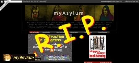
 Say goodbye to the old layout...
Onwards... to the new myAsylum!
(more on the new layout in the full post)
The biggest noticeable changes are, of course, are the new banner image, and the 3-column layout that is used. One of the biggest challenges in getting this up was to re-learn the new Blogger Layout-based template construction, which is what this blog now uses. In other words, the transition from the old to the new Blogger is now complete.
Another big change - this blog is now best viewed with a screen resolution of 1024 pixels across (or higher). Walski hasn't actually tested it with smaller screen resolutions, but what will appear is that the initial view will probably be cut-off at the sides.
Another difference you'll notice is the collapsible blog roll, which by default, is displayed in a collapsed manner, which in effect frees up a lot of real estate. Over the next few weeks, Walski will also update all the older posts to include the new Labels feature of Blogger (Post Categories, in other words). We'll try to keep the number of labels/categories to a minimum, but sufficient enough to cover the eclectic collection of subject matters that spans myAsylum.
Walski has added a new blog roll category - Ward du Bon Journo which contains a collection of blogs and sites of Malaysian journalists, as recommended by Rocky in one of his posts. The rolls need a little bit of cleaning up, so there is a possibility that there may still be some duplication for the time being.
Most of the stuff you remember from the old layout has been retained, at least for now. The availability of an extra side bar (on the left) gives Walski the opportunity to organize stuff a little better. The main post area is now also slightly bigger (by 100 pixels), paving the way for slightly wider pictures, which were previously limited to 400 pixel width.
The only thing missing now is the footer, which Walski will work on a tad bit later tonight. So, if you've been wondering why there have not been many posts of late, now you know why...
By the way, since there's tons of space in the sidebars, do let Walski know if there is some feature you'd like to see on this blog, and Walski will do his best to accommodate the request. Perhaps, a new feature that should be on in due time is a regular opinion poll.
Well, it's back to the drawing board and slave-driving the elves to complete the blog layout...


